Every December, PANTONE® announces its “Color of the Year” for the upcoming turning of the Earth, and this year is no different. On December 7, 2023, PANTONE announced the 2024 Color of the Year to be the warm and cozy shade of Peach Fuzz.
What is the Color of the Year?
The color of the year started in 1999 as a way to create awareness about the relationships between color and culture, according to PANTONE Color Institute Vice President Laurie Pressman. It’s not lost on us that the Color of the Year began about the same time that digital printing began taking over. At this time, fewer and fewer businesses used traditional offset printing which relied on PANTONE’s Color Matching System, and PANTONE needed ways to stay relevant in the changing market. PANTONE’s Color of the Year has definitely kept this company at the forefront of everybody’s minds.
Every December, fashion and interior designers feverishly wait for PANTONE to announce its decision for the Color of the Year, anticipating the wondrous designs they will construct from the newest shade of trend. Once PANTONE makes their announcement, electronics, home goods, and clothing show up all over the market in the new, anticipated hue.
While PANTONE makes their decision based on both market research and “macro-level color trend forecasting,” the color of the year also represents the mood of the global zeitgeist.
What is the Pantone 2024 color of the year?
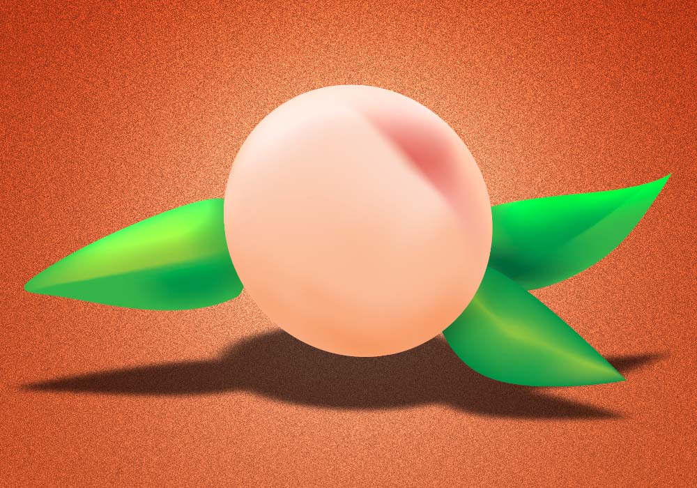
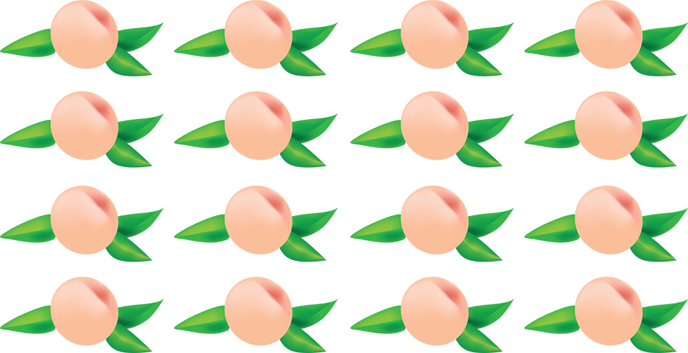
PANTONE believes, after extensive research on current and projected trends, that Peach Fuzz PANTONE 13-1023 will be the most trendy color of 2024. This replaces the 2023 color of the year, Viva Magenta 18-1750.
Can colors have meaning?
A press announcement by the Pantone Color Institute’s Executive Director Leatrice Eiseman described the “velvety gentle peach tone” as a color embodying kindness, tenderness, warmth, modern elegance. Eiseman called Peach Fuzz “a shade that resonates with compassion, offers a tactile embrace and effortlessly bridges the youthful with the timeless.”
But is the soft peachy hue inherently imbued with such meaning? Is the meaning of the color Peach Fuzz universal? Or is this a fanciful, personal opinion of Eiseman’s?
Do colors have a universal meaning?
Matching colors with the meaning and mood they embody is based on principles of color philosophy. Far from some influencer’s current opinion, adherents of color philosophy believe that colors have intrinsic properties and psychological effects on people. Furthermore, these properties transcend trends and personal preferences. This philosophy hypothesizes that each color evokes specific emotions and connotations, influencing human behavior and perceptions in subtle yet profound ways.
For example, people tend to associate blue with calmness and stability, while red may evoke feelings of passion and energy, even hunger. By understanding these somewhat ubiquitous associations, designers can thoughtfully apply color in various fields. Art, marketing, beauty, fashion, and even individuals all convey messages, create desired atmospheres, and affect moods and decisions using color philosophy.
Who chooses Pantone Color Of the Year?
Even though Pantone Color Institute team members come from all over the globe and different industries, they always eventually end up coming to a consensus. And their choice isn’t easily swayed by the options at hand. For example, in 2022, for the first time ever, Pantone created a brand new color, PANTONE 17-3938 Very Peri, as they came to the agreement that none of their existing colors could fully describe the mood of that year.
What does Peach Fuzz look like?
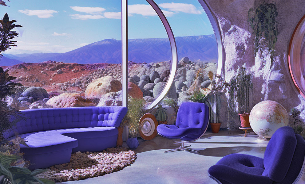
Peach Fuzz strikes us as a Springtime color, radiant with the natural beauty of tenacious blossoms, turning their soft faces East towards the bright dappled morning sun. As adherents of color philosophy ourselves, we see how it fits the global mood at the moment. We also second Eiseman that the hue “echoes our innate yearning for closeness and connection.” With its playful allusion to the most delicate of facial hair, even the color’s name suggests the familial cuddly closeness of snuggling cheek to cheek.
What is the hex color code for Peach Fuzz PANTONE 13-1023?
#FAD3A2 represents the digital approximation of the color in web design and digital graphics.
What colors go with Peach Fuzz?
Peach Fuzz is a very versatile color, but it does not go with everything. So we created some sample palettes you can use for inspiration as you work with this color.

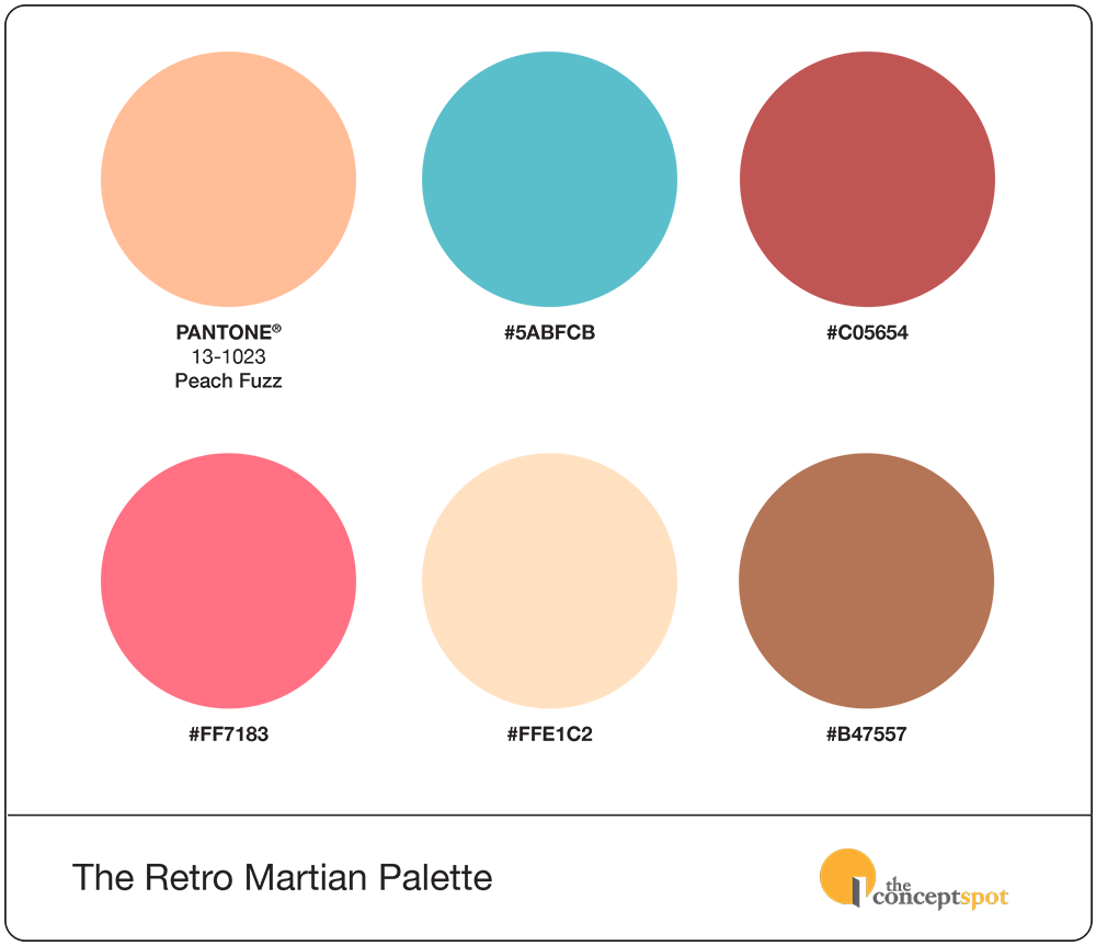
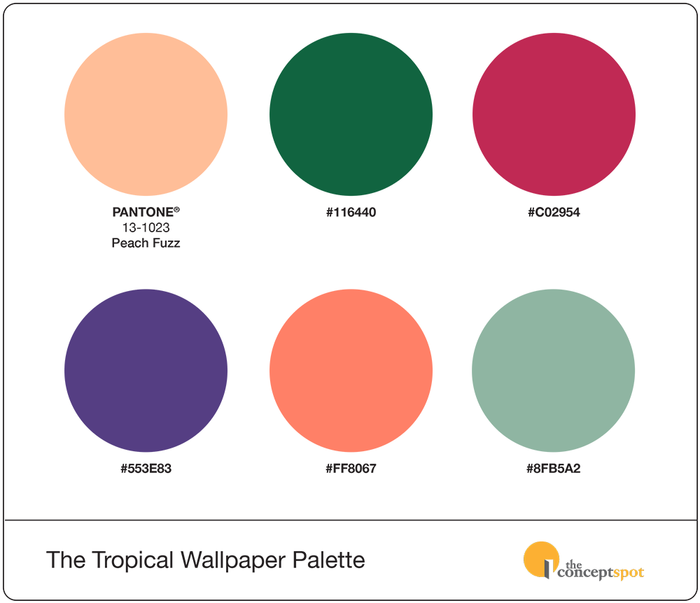
You can also download official sample color palettes that complement PANTONE Peach color code 13-1023 here as part of your Pantone member perks.
How many Pantone peach colors are there?
Pantone has a vast range of color shades, including various peach tones, each with unique identifiers and specific uses in different industries. Identifying every Pantone hue that could be called peach is challenging, since there may be different variations of peach within different Pantone color systems. First, you’d have to choose which PANTONE book to use.
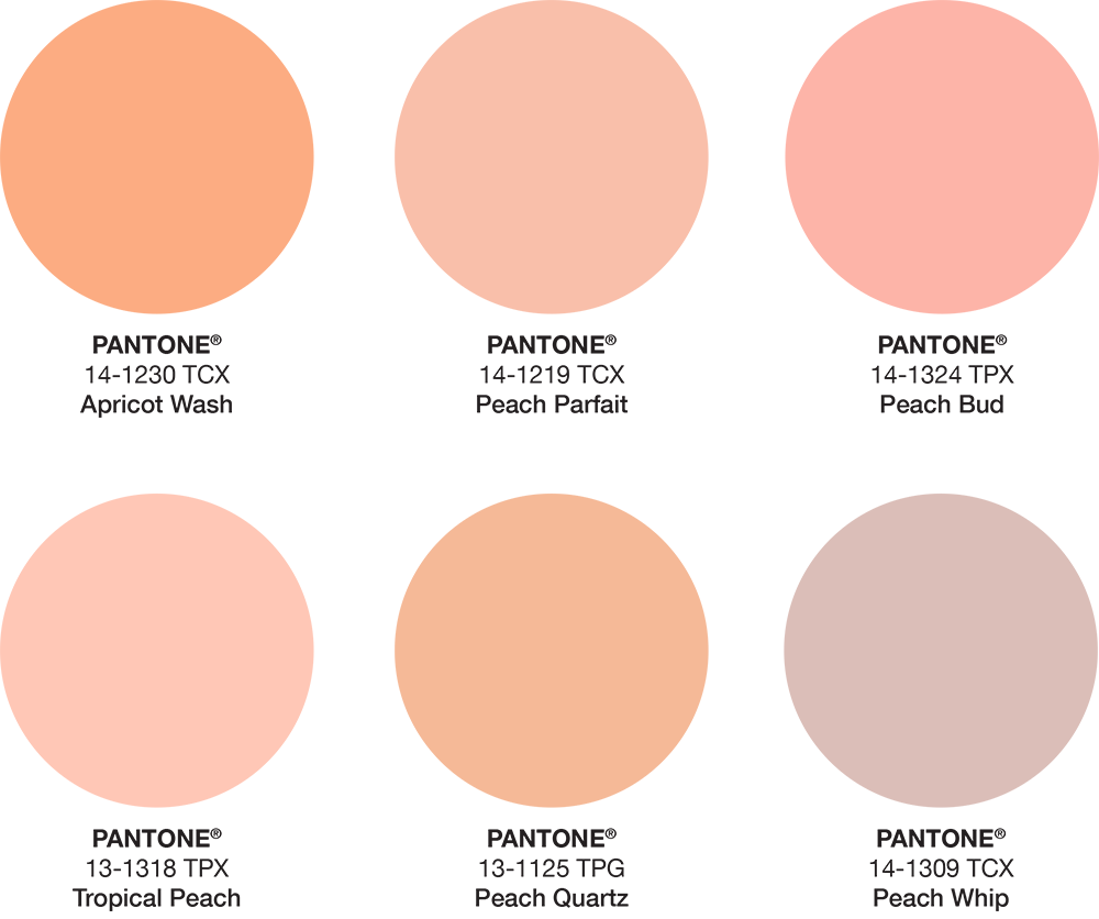
What is the Pantone code for tropical peach?
Tropical Peach is another popular peach hue that is slightly pinker than the color of the year. The Pantone code for Tropical Peach is 13-1318 TPX.
What is the Pantone code for apricot?
Not all PANTONE colors that give you that peachy, fuzzy feeling contain the term “peach.” One example is the similar but brighter color Apricot Wash (14-1230 TCX).
Other PANTONE Peach Colors
- Peach Parfait PANTONE 14-1219 TPX.
- Peach Whip PANTONE 14-1309 TCX.
- Peach Bud PANTONE 14-1324 TPX.
- Peach Quartz PANTONE 13-1125 TPG.
What is the Pantone Color Institute?
The Pantone Color Institute is a division of PANTONE that works directly with clients to finesse brand palettes. They also predict color trends. The PANTONE company itself has been around since the 1960s. With humble beginnings as a printing firm, the company rose to fame with its Pantone Matching System (or PMS). Moreover, this coded system links names and numbers with specified ink color combinations.
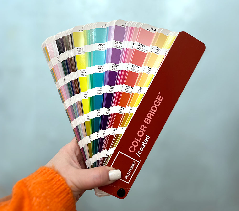
Every year, designers and printers could purchase a color book from PANTONE. Moreover, each PANTONE book contained swatches of almost every color you could imagine. Designers would use it to see what their color choices would look like when printed, and printers would be able to match those colors exactly using PANTONE’s inks and formulas. Keep in mind, these were the days before digital printing had become as prevalent as it is now. Most jobs were printed using offset printing, so printers had a lot more control over the way inks would produce color on the page.
Why was color matching so important before digital printing?
Before digital printing provided a common system for expressing very precise hues, the PMS was crucial for many aspects of print and design.
- Standardization across industries.
- Predictability in color reproduction.
- Quality control.
- Communication across borders.
- Reduced costs and errors.
- Facilitating design and production processes.
Imagine having a logo with a color so unique that you secure a trademark for it. Ensuring this logo appears consistently across all your company’s printed materials would be very important to you.
Are PANTONE inks still relevant?
Using the PANTONE matching system used to be critical for all printed pieces before digital printing. When the offset printing process was more common, designers would often choose a PANTONE color as an accent when printing inexpensive 2-color documents.
In today’s world of digital printing, however, PANTONE colors are used more for high-end jobs. Luxury materials requiring high runs and perfectly matched colors will turn to PANTONE inks to get the right look. In the design world, working with PANTONE colors now also indicates a certain level of luxe.
Should you use Pantone’s 2024 Color of the Year on your website?
The Concept Spot builds cutting-edge websites with the latest color philosophy and trends, including Pantone’s 2024 Color of the Year, Peach Fuzz. Our team also skillfully integrates expert color theory and cutting-edge design to create websites that resonate with your audience. In addition, this ensures your brand stands out as a thought leader in current trends. Choose us to harness the power of color in your website design, where modern elegance meets unparalleled creativity. Contact us now to elevate your brand’s digital presence!