As the chill air heralds the early arrival of dusk, your thoughts drift to cozy winter evenings by the hearth. You can almost feel the fire gently warming your toes and the steam from a spiced hot beverage dewing your cheeks. Inspired, you wonder, is there a way to evoke the moody yet cozy ambiance of a dark winter’s night with my website design?
There are three basic design elements of any website: color palette, font, and imagery. Each of these elements can be gloomified to infuse your website with the captivating aesthetic of snow falling in the mysterious backwoods on a dark wintry night.
Moody Color Palette
Since these deep, dramatic palettes are a current trend in interior design, we can use an example from interior design for inspiration. What colors set what moods? Which moody colors convey what meaning? What are the moody colors for 2025?
Think of the inviting feel of a dark, cozy room. The warm neutrals on the dark walls create the dark background for a dark, moody atmosphere. The only lighting in the space is a warm orange glow emanating from a crackling fireplace.
The web designer has to create a dark tone on a website similar to how an interior designer creates a dark moody atmosphere within a room. The main difference is that in a real-life room space, almost nothing is backlit, whereas on a screen, everything is backlit.
So while a room can get moodier just with lighting, a website must look moody at any brightness level. Instead of just adding any dark hues, the web designer must focus on what makes moody colors inherently moody.
Tenets of Moody colors:
- Colour palette tends to be darker and cooler-dark green, deep purples, moody blues, and other cool, dark colors dominate images.
- Low saturation colors-rather than specific colors, focus on contrast, lighting, and shadows. Even typically light, warm hues like orange can be made more soft and deep with less contrast and more shadows.
- No pure white or pure black–instead, this sophisticated palette uses light grays and charcoal, which cast a more gloomy mood. That way, patterns can really highlight one specific part of the imagery by creating a pop of light against the darker background.
How to create your own Moody Color Palette:
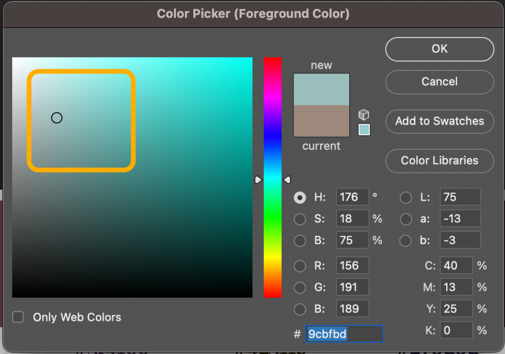
What colors are moody? In order to create a moody website design, select dark, complimentary colors that you can find within the lower middle of the color field in any color picker window. Below, you can see the field within the Color Picker window in Photoshop 2024, highlighted in orange.

Here’s a screenshot of what the Color Picker tool in Canva looks like.

Notice that the highlighted field in the screenshot does not extend to the edges. Therefore, no pure white, pure black, or heavily saturated color can make it into your palette. Pulling a color from the highlighted area of the color field will endure that the color contains significant amounts of gray, muting the saturation of the color while still keeping it heavy and dark.
No palette would be complete without some light colors for contrast. Create 2-3 contrasting light colors by working in the upper left-hand corner of the highlighted color field in the screenshot below.
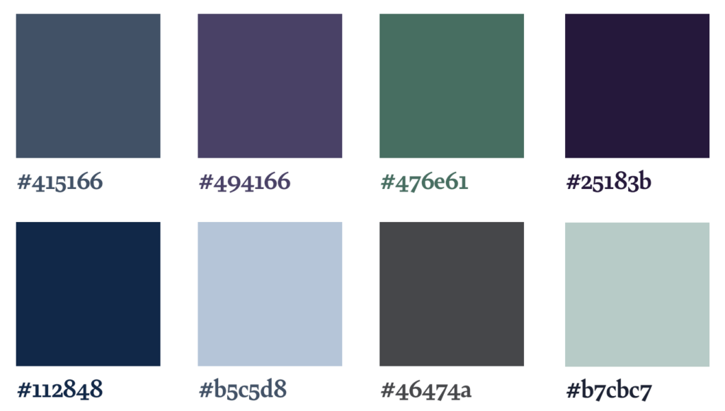
Sample Moody Color Palettes
How do I find my color palette style? The great thing about staying in the sections of the color field shown in the screenshots above is that almost all the colors you select will go well with one another.
Here are some examples of on-trend dark and moody color palette combinations you can use for styling inspiration right now. Or, mix and match to make your own!
Natural Moody Palette
Envision the deep green of a forest floor, where the canopy is too dense to let in much natural light. The many rich shades of green and neutrals add depth to the space without much variation in hue. Cool colors like forest green, blue, and purple combined with neutrals create a dark moody vibe that also feels organic.

Warm Cozy Bookstore Aesthetic
Dark paint on the walls, soft upholstery with rich texture, and wooden shelves crowded with books can instantly turn any room into a cozy reading space. The blog posts on your website can be more pleasant and comfortable to read using the same styling.

Cool Blues Moody Palette
What is the most calming color palette? What about a sophisticated, tranquil masculine palette? Even when it stands alone, blue often evokes a calm mood. Best of all, most different shades and hues of blue go well together.
Depressed Vampire Moody Palette
Nothing is more iconic of the dark, moody trend than the beauty and mystery of modern vampire stories. When writing a classic vampire novel, the writer’s description will often paint rich images of a dimly-lit room deep within a gloomy castle, where tapestries woven from deep hues add texture to dark walls of natural stone.

Dark Academia Moody Palette
What design style is dark academia? While instantly recognizable, this darker preppy décor style from novels and movies is broad and hard to summarize. Combining a moody colour palette of blue and green with a few subtle scholarly design elements can create the dark academic aesthetic so popular with teens at the moment. And who knows moody better than teenagers?

Dark and Moody Fonts
In order to achieve the morose, brooding, sophisticated, even over-educated feel inherent within a moody design, you’ll need to select appropriate fonts. While it may be tempting to use dark letters on a dark background, or ridiculously decorative calligraphy, remember that readability is as important (if not more important) than aesthetics.
Choose fonts with sweeping tails, exaggerated serifs, and whimsical ligatures to achieve a look that is both splendid and hauntingly tragic, just like your design’s soul.
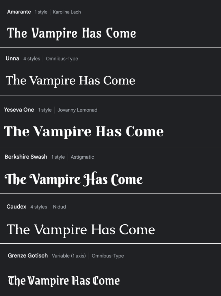
Tenets of a dark and moody display font:
A display font is the font you use for headlines, titles, and other bits of type that usually only consist of a few words. When you use a display font, you can have lots of fun with the letters themselves and make them as large as possible. For instance, the title of a book might be designed using a display font.
- Large, swooping, calligraphic ascenders and descenders.
- Round bowls.
- Sufficient options for ligatures and additional glyphs.
- A touch of whimsy.
- Hints of blackletter type.
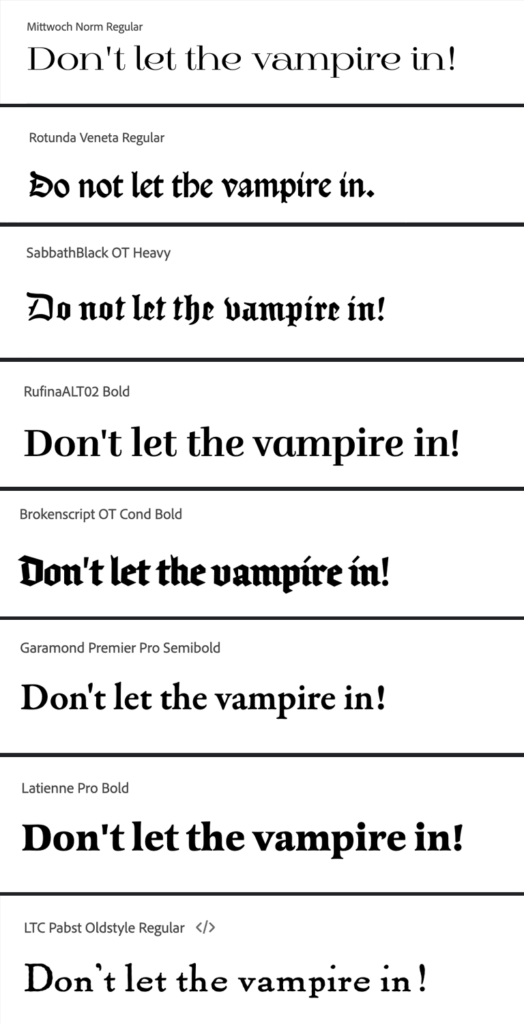
Tenets of a dark and moody body (column) font:
A body (or column) font is the font you would use for the bulk of text on a document. Anything that is a paragraph or longer should use an appropriate body font. For instance, the pages of a book would most likely be set in a body typeface. The following typeface characteristics invoke a moody vibe.
- Geometric or gothic shape.
- Small variation between thicks and thins.
- Angled pen axis for serifs.
Sample Moody Design Fonts
Our go-to sources for moody design fonts are Google Fonts and Adobe Fonts, both of which have tons of options that can be mixed and matched to create an excellent complement to your brooding and whimsical aesthetic. As a bonus, these fonts tend to display correctly across different browsers.
Google fonts are free to use and can be downloaded and used in print designs, or linked or embedded into websites for web design.
Adobe fonts come with your Adobe CC license and can be easily incorporated into print work you do for yourself or for your clients. You can also use Adobe fonts on your own website. In order to use Adobe fonts on a client’s website, your client will need to obtain their own Adobe license.
Our favorite moody Display Google Fonts
Our favorite moody Display Adobe Fonts
Moody Design Elements
Once you define your moody colors and select your fonts, there are other fun elements you can insert into your design to really drive that dramatic, moody style home.

Small design elements such as these are particularly important when creating a dark and moody website. When you paint a moody painting, you’d use sparse lighter paint colors to give the art enough contrast to be visible. When you decorate a room, you can use exclusively very dark colors on both the accent décor and the paint on the walls, and rely on natural light to provide visibility. But how do you make a dark and moody aesthetic in a backlit digital format without losing visibility?
When you design a moody website, rather than a room or a painting, you are confined to a modern, digital space and UX best practices. You don’t have the freedom of using certain materials or effects when creating your look. Adding in the following design elements can up the moodiness without sacrificing usability or accessibility. These elements specifically can also help differentiate a moody website from a gothic website.
Tenets of Moody Design Elements
- Evoke a bygone time.
- Subtle variations in colors between parts of an individual design element (such as a pattern against its background).
- Repeating floral motifs.
- Torn or burnt edges.
- Faded text.
- Worn textures.
- Wood grain.
- Wainscoting.
- Stacks or rows of old books.
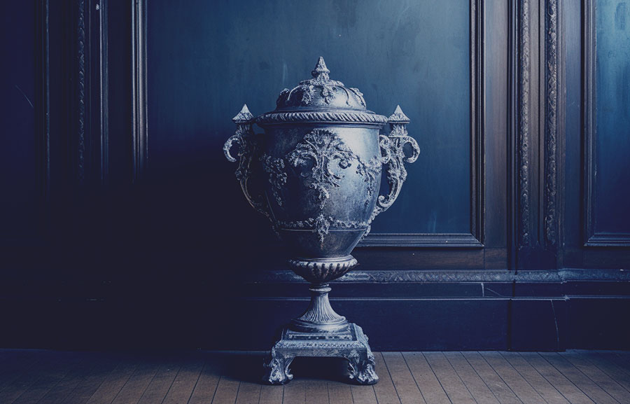
- Urns.
How do I make my website dark and moody?
The creation of a moody website calls for a nuanced approach that balances low-contrast dark hues and gothic fonts with antiquated or rustic images and practical functionality. We hope this guide provides you with a comprehensive approach to crafting a website that is visually captivating with its melancholic ambiance, yet remains user-friendly and functional, striking a delicate balance between the dramatic flair of dark aesthetics and the practical necessities of modern web design.
If you find your attempts to transform your website into a moody masterpiece all end up looking suspiciously similar to your old Myspace page, that’s what we’re here for. Contact us today and let our expert design team bring your gloomiest ideas to life. With our keen eye for sophisticated color palettes, engaging fonts, and striking aesthetics, we’ll ensure your website not only looks stunning but also safely enhances user experience.
Every business needs a website, and every website tells a story. Embellish your online presence with a design that mirrors the haunting elegance of a somber winter evening. Get in touch now to begin crafting your unique, mesmerizing digital space!