The sun peeks over the horizon as you step into the garden, the wooden gate snapping shut behind you. The grass brushes your bare ankles and morning dew dampens the hem of your white cotton dress as you gracefully bend down to feed the clucking chickens. As they peck at their organic fare, you fill your apron with fresh eggs in a rainbow of pastels. Drying your fingers on an embroidered lace pocket kerchief, you wander inside your centuries-old stone cottage, where you have herbs drying from the kitchen ceiling, and a warm fire heating up a tea kettle. You couldn’t get any more cottagecore.
What is cottagecore aesthetic?
That’s what the cottagecore aesthetic is in a nutshell: cultivating the feeling of being blissfully connected to the land and the good parts of living in the sunny countryside. This aesthetic can feel nostalgic to anyone, even the die-hard city slicker, because it mimics a bygone time that all of our ancestors likely experienced at some point in history. Even I sometimes find myself drawn to the feelings this aesthetic evokes, despite the fact that I grew up in an economically-depressed rural area and am all too familiar with its dark side. Nostalgia is funny like that—it shrouds the peripheral vision, focusing on the more pleasant parts of a memory or ideal.

What is cottage core style, and where does it come from?
Cottage core is a nostalgic style that romanticizes a simple country life while blissfully glossing over the dark underlying factors. I’m reminded of watching The Sound of Music 50 times as a kid, and barely even noticing the Nazis. That’s just how nostalgia works. The breezy, homey, simple life we glimpse on a drive through the countryside only appears so because of the you’re moving too fast to notice the details.
I’m not saying people can’t be happy in the country, but that doesn’t mean life there is all porch swings and lemonade. For example, my childhood friends who lived in an adorable log cabin complained about the butt-biting drafts that no amount of patching with clay, dung, moss, and hair could stifle. Our neighbors milked cute lowing cows before going to school, not while watching the soft glow of sunrise illuminate the rolling hills, but often between shoveling snow and shoveling manure while squinting under the harsh fluorescent lights illuminating the barn in the predawn darkness. When my sister and I foraged for herbs, we hung them to dry in the garage rafters where the diesel exhaust collected, having acquired said herbs by…er…well, let’s just say we didn’t pick them on our own property.

Yet after living in the big city for a couple decades, I find myself conveniently forgetting about what it’s really like to pine for luxuries like insulation and plumbing. I’m guilty of fantasizing about escaping to the simple life of a rustic stone cottage in a flower-strewn field. Because let’s face it, a simple country life in tune with nature sounds quite pleasant, in the absence of actual necessity.
What is cottage core design, and where can you use it?
Cottagecore design is all about emulating the prettiest parts of country living, while downplaying or hiding away the technology and modern luxuries. Home design in the style uses the aesthetic of simple country living as a costume for something that actually has all t
he comforts and conveniences one would expect in the city. Perhaps being surrounded by an aesthetic that represents doing things the slow, old-fashioned, rustic way really do slow your racing thoughts and help you live in the moment. It certainly feels peaceful to look at. And lucky for you, you can emulate cottage core’s romantic-countryside-minus-the-animal-dung vibe anywhere—in your high-rise apartment, in your comfortable casual wardrobe, and even on your website.
Cottagecore color palette
The easiest way to set the foundation for a cottage core look is with an appropriate color palette. Yet no single color palette defines the aesthetic. So what are cottagecore colors?
It’s more about how the colors interact with each other. With a cottagecore palette, the overall palette creates a sense of calm and reflect colors found in nature, both neutral and bright.
Within any cottage core palette, you’ll find a mix of:
- Light colors creating a sense of a springtime sunrise on the prairie,
- Light neutrals mimicking natural textiles like linen, wood, stone, soil, and other natural building materials,
- Contrasting brighter colors reminiscent of wildflowers, home cooking, and the wide open sky,
- Contrasting darker colors taken from the natural world, like the sooty blue-gray of a wet stone riverbank, or the deep green of a mossy tree.
Cottagecore color palettes with hex codes
Example #1: The Stone Cottage
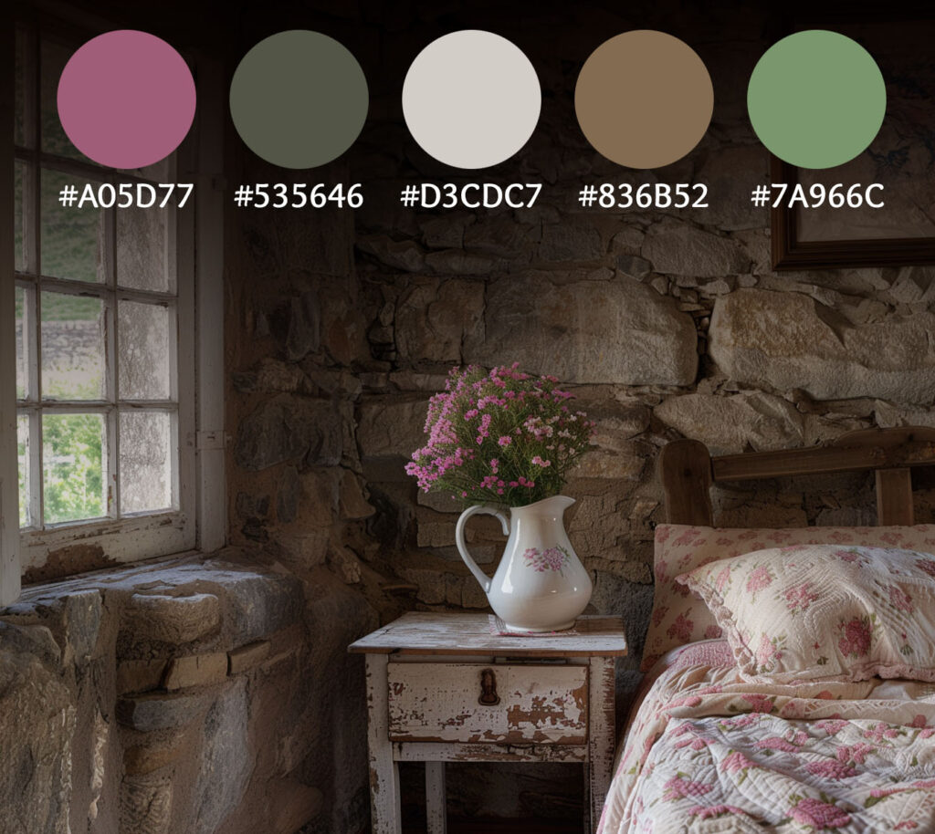

Check out our Pinterest page for more Cottagecore Color Palette ideas!
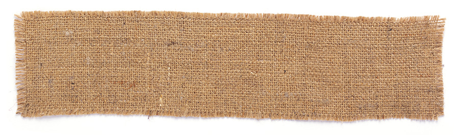
Cottagecore textures
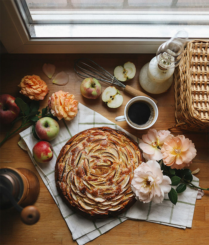
Cottage core is a feeling as much as it is a look. Cottage core home decor has such pronounced textural components that it’s hard to resist fondling every item we pass by. Think of the linear weave of linen, or the slightly bumpy softness of washed cotton. Imagine the powdery crags of gravel, the flaky uneven shine of seasoned cast iron, or the splintering fibrousness of sisal. Envision handmade items, like knobly crocheted blankets, slightly creased tanned leather, or gritty clay pottery. Cottage core design can include any textures that you might find in a bygone, simpler time, and ideally a mixture thereof.
How to translate texture to a visual or digital surface
As in any design that invokes simplicity, less is more. For contrast, focus on the shadows within a texture, rather than contrasting colors. Subtle indications of texture in backgrounds and frame borders are the easiest way to use cottage core textures in a digital space.
Example texture #1: The burlap bag weave
Example texture #2: Gingham fabric

There are so many more options to choose from. Just root through your Nana’s fabric scrap collection and you’re bound to find some ideas!
Cottagecore details
Similar to textures, details are nods to the cottage core look that you can sprinkle throughout your design in a meaningful way. Details tend to favor a mix of practical and whimsical, without obvious technology or luxury. Create a nostalgic, rustic feeling in your images with the following visual elements.
- Flowers and plants, fresh and dried, especially wild ones.
- Vintage or antique farmhouse furniture and appliances.
- Candles, lanterns, log fires, and pot bellied stoves.
- Quilts, knitting, and lace.
- Woven wicker picnic baskets, or rattan tea trays.
- Ceramic teacups and colored glass bottles.
- Antiqued brass knobs and copper handles.
- Cute farm animal imagery.
- Whitewashed picket fences and cobbled garden paths.
- Home cooking items, like gingham aprons and wooden spoons.
- Families coming together at a large wooden table around a hearty meal.
- Open shelving, displaying cookbooks or ceramic bric-a-brac.
- Sheer curtains with floral designs, billowing from sunny open windows.
- White cotton sheets drying on a clothesline.
- Fireflies blinking in the darkness just beyond the firelight.
- Rain barrels, milk churns, gardening gloves, and similar lighthearted farm equipment.

When using people in your imagery, go for minimal makeup and jewelry and unstyled hair. Dress should feature natural, neutral, free flowing, and comfortable garments that are hard to place in a specific time period. Show people of multiple generations in natural settings in natural lighting, interacting with nature or animals.
Example detail #1: Lace strip

Example detail #2: Decorative divider

What to avoid
Perhaps even more important than what is included, omission is a huge factor in keeping cottage core beautiful. It’s common sense to avoid explaining the gory steps that a cute clucking hen takes on its way from farm to table to your dinner guests, or to hide the manure-caked galoshes out back while ushering company in the front door. The unsavory elements of the country life fall outside of the idyllic world of cottage core.

Photo by De an Sun on Unsplash
Similarly, you should take care to minimize the modern in your imagery. Colorful sneakers, plastic toys, and blinking LEDs on electronics, while all part of a genuine modern farm life, detract from romanticized cottagecore aesthetics.
Cottagecore Fonts
Fonts can make or break website designs. Visitors just can’t enjoy your site if the font is too difficult to read. Intensely stylized fonts distract from simplicity, and not all fonts display correctly across different tech. Fortunately, many traditional fonts can work well with cottage core.
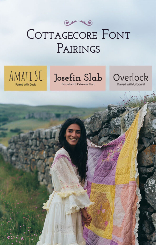
Font Pairings
In most elegant commercial design, font pairings are minimized. Mixing too many fonts can look messy and busy, but it can also add a homey, handmade, and vintage feel to your decorating. If your brand story focuses on cottagecore vibes, your web design might just be the right place to play with disparate fonts. Think of a hand-painted sign advertising fresh eggs, bundles wrapped in newsprint, looping embroidery on a wall hanging, or the spidery penciled note in Grandma’s cookbook. All of these fonts are available for free from Google Fonts.


Free Fonts
Because a variety of traditional and handwritten fonts fit with the vintage vibes of cottage core, you don’t need to purchase highly specific fonts for this look. Here are my favorite fonts for a cottage core look that you can download and install for free from Google Fonts:

Cottagecore website design tutorial
With these tutorials, your website should be well on its way to embodying a cottagecore vibe. Trendy yet timeless, this fashionable aesthetic can enhance your brand now, and age gracefully through time. If there are similar web design tutorials you’re craving, drop me a comment. Meanwhile, here are tutorials on how to ceate a dark and moody website and how to create a gothic website. If your cottage core website isn’t quite what you envisioned, The Concept Spot is here to help! We specialize in building fully-customized, unique websites for small businesses. Contact us today to get started on the unique website of your dreams. A design tutorial on cottagecore fonts, textures, colors and details.